 Design Snap
Generate a shadcn/ui theme from any website
Design Snap is a Chrome extension that turns any website into a shadcn/ui theme. It extracts the site's palette, maps each color to shadcn/ui's semantic roles — background, foreground, primary, secondary, muted, border — and outputs a block ready to paste into globals.css, with a real or generated dark variant.
Rated 5.0/5 on the Chrome Web Store · read the reviews · Free plan · No account · 100% local analysis
How to generate a shadcn/ui theme from a website
Generating a shadcn/ui theme from an existing website takes three steps: extract the site's design tokens with Design Snap, review the semantic color roles in the Theme tab, and copy the generated variables into your globals.css. Light and dark blocks are generated together.
-
Extract
Open the website, click the Design Snap icon and press Extract. The palette is ranked by real usage.
-
Review the color roles
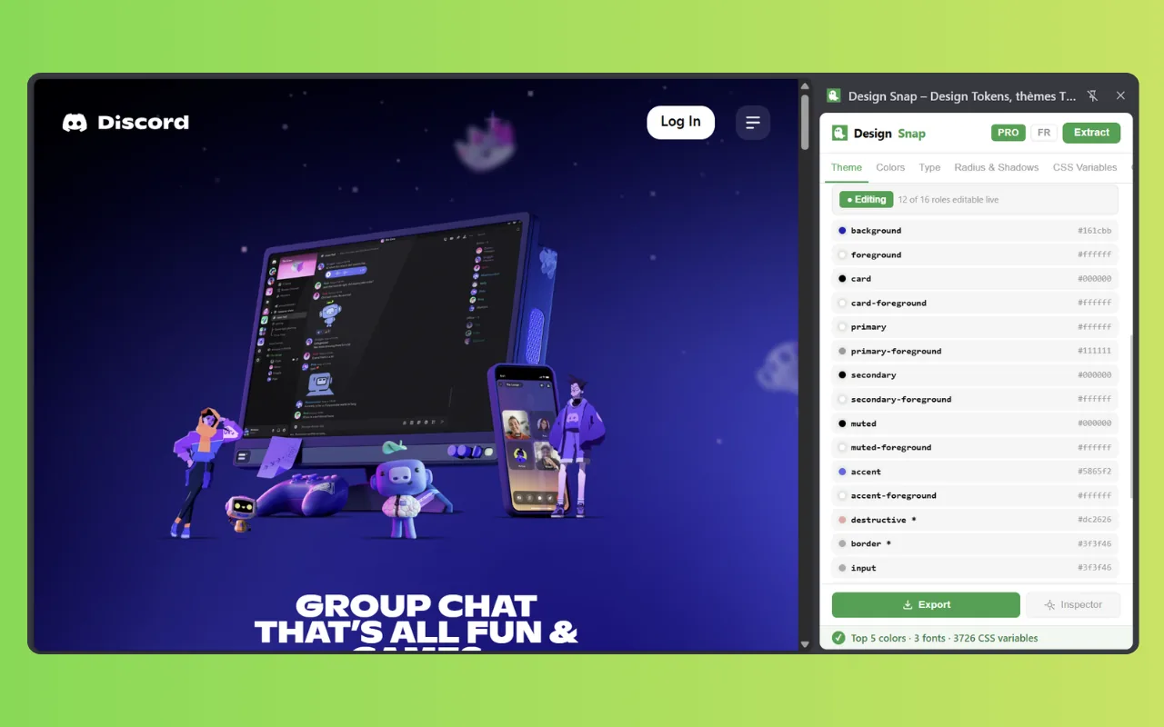
The Theme tab shows each shadcn/ui role — background, foreground, primary, muted… — with the hex value assigned from the page.
-
Paste into globals.css
Click shadcn/ui to copy the variables. Paste them into your
globals.css— your components are themed instantly.
Semantic roles, assigned from real usage
Design Snap doesn't guess: it looks at how each color is actually used on the page — backgrounds, text, buttons, borders — and maps it to the matching shadcn/ui role.
background/foregroundfrom the page's base surfaces and textprimaryfrom the dominant interactive color (buttons, links)secondary,muted,accent,borderfrom supporting colors--radiusfrom the most frequent border-radius on the page
:root {
  --background: 0 0% 98%;
  --foreground: 222 47% 11%;
  --primary: 239 84% 67%;
  --primary-foreground: 0 0% 100%;
  --secondary: 220 14% 96%;
  --muted: 215 20% 65%;
  --border: 214 32% 91%;
  --radius: 0.5rem;
}.dark {
--background: 222 47% 7%;
--foreground: 210 40% 98%;
--primary: 239 84% 72%;
--primary-foreground: 0 0% 100%;
--secondary: 217 33% 17%;
--muted: 215 20% 45%;
--border: 217 33% 20%;
--radius: 0.5rem;
}If the site ships a real dark mode, these values are extracted from it. If not, Design Snap generates a coherent dark variant from the light palette.
shadcn/ui export — FAQ
Design Snap analyzes how each extracted color is actually used on the page — backgrounds, text, buttons, borders — and assigns it to the matching shadcn/ui semantic role: background, foreground, card, primary, secondary, muted, accent, border and more. The result is a coherent theme, not a random mapping.
Yes. If the site has a real dark mode, Design Snap extracts it automatically. If it doesn't, Design Snap generates a coherent dark variant from the light palette. Both light and dark blocks are included in the export, ready for globals.css.
The shadcn/ui export is a PRO feature (€4.99 once, lifetime — no subscription), together with the Tailwind v4 @theme export, real dark-mode extraction, the Design DNA card and unlimited snapshots. Token extraction itself and 4 export formats — JSON, CSS variables, Tailwind config, Figma — are free. See pricing.
Related tools
Tailwind theme generator
Get a ready-to-paste tailwind.config.js or Tailwind v4 @theme from any site.
Extract CSS variables
List every CSS custom property declared on :root of any website.
Color palette extractor
Get any website's colors ranked by real usage, with hex values.
vs DevTools & CSS Peeper
How Design Snap compares to Chrome DevTools and CSS Peeper.